I don't think so... You're the only one that's said anything about it... other than Bart... But he doesn't count, cause he saw it when it was "fresh"...
An acclaimed neurosurgeon, jet car driver, particle physicist, monster hunter and, of course, rock star… antacost currently resides in this dimension with a wife and two cats.

2 comments:
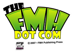
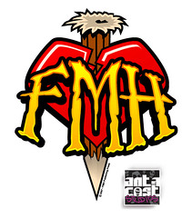
From the bottom up, the new "stake" logo looks much better with the new lettering. I love the Big Fat letter for the website logo, has Aaron seen it?
I don't think so... You're the only one that's said anything about it... other than Bart... But he doesn't count, cause he saw it when it was "fresh"...
Post a Comment